Following on from last week’s topic of the fallacy of gold being a great inflationary hedge, this week I would like to take a look at the price of gold compared to the price of stocks. As we discussed last week, there are many in the investing community who believe that an investment in gold is an ideal hedge against inflation. Last week, we saw how this is not really so.
What really interests me though, as a share trader and investor, is the comparison between the gold price and the overall prices of stocks. Looking at the charts below, it is pretty clear to see that the long term performance of stocks and shares is far superior to a long term investment in gold.
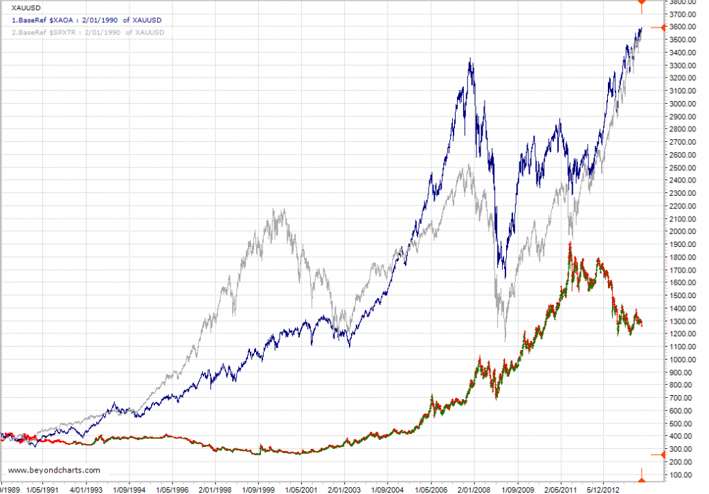
The chart below shows a near 25 year period from January 1990 to the present day. This chart compares the long term performance of both the ASX All Ordinaries Accumulation Index and the S&P500 Total Return Index to the gold price in USD. This time frame encompasses a wide range of global events that have had dramatic impact on global share markets including the World Trade Centre attacks, the 2003 -2007 bull market, the Global Financial Crisis, and a host of others.
These charts represent a ‘buy and hold’ strategy of the overall index, including all dividends. This could involve buying a basket of stocks that mirrors the components of the index, buying an index fund or an ETF that replicates stocks held in the index.
The red/green chart is the gold price in USD, the upper blue line is the All Ords Accumulation Index and the grey line is the S&P500 Total Return Index.
Both the S&P Total Return Index and the All Ords Accumulation Index have been clear outperformers over this 25 year period, never once having underperformed the gold price the whole time, including during the GFC!!
Both of these indexes include dividend returns. As well as holding stocks for capital growth, shareholders also received dividends on their holdings over this 25 year period. A holding of gold bullion or futures contracts attracts NO dividend return. It is essentially the same as holding onto a vacant block of land with a long term view that it will increase in value, but not receiving any rent!
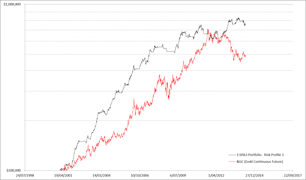
Now, let’s take a look at the performance of an actively managed share portfolio compared to the price of gold, as opposed to a simple buy and hold share investing strategy. The chart below shows the performance of the publicly traded SPA3 portfolio compared to the gold price over the length of the SPA3 public portfolio or 13.4 years.
Since the inception of the public portfolio in 2001, SPA3 has consistently outperformed the price of gold, apart from a few wobbles in late 2010, early 2011. Admittedly, this chart does represent a ‘buy and hold’ position in gold vs an actively managed share portfolio – taking all buy and sell orders according to the rules, and reverting to cash during periods of high market risk. But, that is the whole point. Holding onto gold as an inflation hedge and a wealth protection strategy is exactly what the ‘gold bugs’ advocate. Clearly, an actively managed share portfolio is the clear winner as both a hedge against inflation and as a wealth creation strategy.


Hi Gary
The claim you make in your article: that gold has not once outperformed gold in the past 25 years is clearly wrong.
If you start from the same base in 1990, and never sell either, it is correct, but gold has clearly outperformed the market since 2000 (even inclusive of dividends), and has also outperformed the market during the first 6 months of this year.
As an advocate of timing the market, I hardly think it’s fair to assume that gold buyers cannot do the same, in order to make a point.
How can you claim that all so called “gold bugs” have a single strategy that applies to all.
From 2000 to 2014, the returns (with stock dividends, are actually –
S & P 500 76% vs Gold 380% !
While I have no argument with your overall theme, I’m amazed at the performance of gold over the SPA existence period – given the outperformance of SPA, surely gold has outperformed the ASX Accumulation Index and the S&P over that 13 year period?
Once again my comments haven’t gotten through. Perhaps my email is not registered?? perhaps I inadvertently sent via facebook and it didn’t work for some reason, anyway .. a very intersting article + charts above. I was wondering if Spa 3 public portfolio performance charts include dividend reinvestments and/or bank interest in times of high market risk? if so perhaps the spa 3 performance chart should be compared to the all ords accumulation index rather that the straight out all ords chart.
Response to Comment by Greg:
Your comment regarding “not once” obviously refers to the statement in the blog: “never once having underperformed the gold price the whole time”. I agree this is ambiguous. The comment was in reference to the fact that in the Base100 chart based to 1990 the Gold price never rose above the XAOA or the SPXTR. There certainly were periods when Gold out and underperformed equities over the plotted period. Sorry for the ambiguity.
There will always be periods when a particular market or instrument will out-perform another. This is the nature of financial markets and is especially so as the overall investment time frame decreases.
The point to the two part blog was that people who hold the view that investing in gold is one of the best, if not the best, long term buy and hold hedge ( e.g. ~25 years or even longer) against inflation is simply not true. The point demonstrated in the two-part blog is that buying and holding Gold would have under-performed buying and holding the All Ordinaries Accumulation Index or S&P500 Total Return Index over such a period.
Over the years I can recall so many stories from newspaper articles, newsletters, customers, friends and business colleges about holding Gold as the way to hedge against inflation. Hence the first section of this week’s blog was not about applying an active investment strategy, it was about exploring the scenario of Gold as the hedging instrument of choice.
In fact, to add further weight to the points made in the blog, achieving a return equivalent of the S&P500 WITHOUT DIVIDENDS since 1990 would still have performed better than holding Gold over this period. And looking at the 36 year period since 1978 WITHOUT DIVIDENDS stocks would have provided a three-fold better return that Gold. WITH DIVIDENDS would have been even better, I estimate another 1.5 – 2 fold improvement with compounding, but I don’t have the S&P500 Total Return data at hand all the way back to 1978 to do the comparison.
The point is that it may just be a myth that Gold is the best strategy for long term hedging against inflation. Sure Gold looks good and has some great qualities but humans might just be caught up in the lure of the yellow stuff when it comes to justifying it as the best hedge against inflation.
Your second point regarding gold strategies is correct but people who buy gold as an inflationary hedge tend to do so as a buy and hold rather than using an active strategy to trade it. There would literally be hundreds of strategies based around timing Gold. Timing ‘Gold’, just like timing stocks or the index, would be my personal preference to investing in Gold rather than buying and holding it as a long term hedge against inflation.
Response to Comment by Alistair:
You are correct. As per my reply to Greg, over the 13 year period since March 2001 Gold has out-performed the All Ordinaries Index and SP500.
We just didn’t show this as the article was focused on using gold as a long term inflationary hedge.
Response to Comment by Jennifer:
Just to clarify, the SPA3 Public Portfolio graph in the blog above is compared to the Gold price, not the All Ords.
The All Ords would have ended just above the writing in the bottom right hand corner, about half way to the fist line from the bottom.
The All Ords Accumulation Index would have finished just about on the second line from the bottom, just under half way to the where the SPA3 portfolio equity curve finished on the hard right hand edge.
The SPA3 equity curve above does include dividends being re-invested and it does include interest during High Market Risk periods.
I typically show the SPA3 equity curve against both the All Ords an its Accumulation Index when presenting to users of SPA3 and only the All Ords when presenting to non-users of SPA3.
This is simply because very very few alternative investment avenues, such as Managed Funds, to SPA3 (and other active strategies with an edge) can get anywhere near similar returns to the Accumulation Index over the long term. The majority of Managed Funds achieve just under the All Ords over the long term.
FYI: The All Ords runs at about 4% CAGR under the All Ords Accumulation Index over rolling 5 year periods. And the S&P500 runs at about 2.5% CAGR under the S&P500 TR Index over rolling 5 year periods.
However, active investors with an edge should aim to outperform the All Ords Accumulation Index by around 4% CAGR, which would be about 8% CAGR better than the All Ords (and hence Managed Funds, on average).